The Nokia 6.2 Unboxing/Cover By Shazil Butt
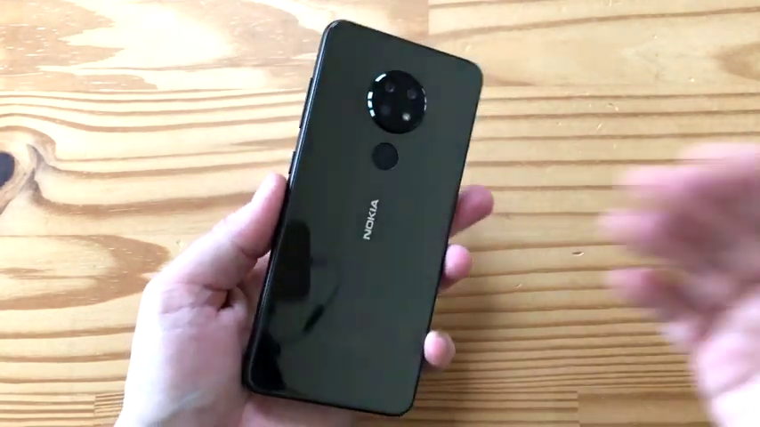
The Nokia 6.2 Unboxing
Welcome to Another Day, another unboxing, and here is the Nokia 6.2. You probably will remember that unbox innocuous 7 points to a recent.
I’ll put it up here and you’re probably wondering what’s the difference, really? Because if you look at them in photos, they look identical. Well, think of the 6.2 like a sibling, a little discontented version of the 7.2 is missing a few things, but it’s at the core, the same chassis in the same form.
So let’s have a quick look, shall we? So here’s the box some aim is here.
Nothing here other than the 6.2 logos. This should give you a good idea of what specs to expect. Snapdragon 636, 168-megapixel cameras with a 5 depth and 8 front, 6.3 inches 10 ADP display.
You know, a lot of this is again similar to the 7.2but slightly different. So let’s open this up, shall we? Don, to add to that. Oh, here we go. Nothing on this site. We get the phone front center. That’s exciting.
Let’s have a look at this in a second. Then we have a simple removal tool here with a divider. Nothing too much here.
Some literature, of course, getting started at 6.2.
Very similar to the 7.2. Shows you how to do this. And then we’ve got a product and safety nobody cares about. But the next thing is a divider. So what’s in here, huh?
You know, it’s charger and cable, presumably. Boom. Or in earbuds. Nice.
So we’ve got earbuds because. Yes, this has headphone jacks or 3.5-millimeter earbuds. It’s nice to include that still.
And then we’ve got A use B type C on one end right here, you can see. And USP type A on the other end, you can see here, cable and a small charger, you SBA.
I’m not sure what the wattage is. I don’t expect this to be much more than 15 watts. So let’s check out the phone, shall we?
That’s it right here. As you can see, very similar to the Nokia 7.2.
And let’s see if I can remove this easily by just sliding it out like that. Notices say, hey, Google, get a dedicated Google Assistant button, just like the 7.2. Let’s the phone again.
Almost a dead ringer for the 7.2 glass back. But polycarbonate like resin, really hard. Plastic machined though frame.
So not aluminum, identical to the 7.2. So is the layout.
You’ve got a symmetry with my CRISTIE expansion on the left-hand side here with the assistant button. You got a USB type C microphone and Monov speaker on the bottom. You’ve got a volume rocker and PA low key on the right-hand side and on top, you have a headphone jack secondary mike in the back.
You have a triple camera system, fingerprint reader. And that’s basically it.
There’s very little that’s different here. Both phones have the Pringle print reader in the back. Both phones have a 3500 million-hour battery. Both phones have a triple camera system and LCD flash in the back.
And again, both phones have this display. It’s a 6.3-inch display with a teardrop march appears a bit of a chin with the Nokia logo.
Again, same design, 10 ATP HDR eyepiece panel. What else is changing? So this is a Snapdragon 636 in it, the 7.2 has a Snapdragon 660. Also, less RAM and less storage start at 32 gigs.
The stored 3 gigs around. This is a 64 gig storage for gigs around the version and the 7.2 starts at 64 and 4 and goes up to 6 gigs, a RAM, and 128 gigs of storage.
So, you know, it’s just slight differences like that and makes the price a little bit more affordable.
And then in terms of cameras, there are some differences to the 7.2 a 48-megapixel main camera that Sony IMX 586.
This is a 16-megapixel main camera, but they’re both the same F-stop, which is F over1.8. And then there’s an 8 megapixel F over 2.2 ultras wide. That’s the same on both. And a 5-megapixel depth sensor.
That’s again, the same on both in the front. That front-facing camera in that year, Rob Notch, is a little lesser on the 6.2 on the 7.2 is a 20 megapixel F over 2.0.
On this one, it’s an 8 megapixel F for the 2.0. So, again, you know, instead of having that quad pixel binning that you have on the 7.2 for the front camera and rear camera, the 6.2 drops, all that and, you know, comes in at a lower price point of it.
So the question is. How much less money are you spending?
Well, the Nokia 7 points to the base price for this 329$ US and the 6.2 here, its price is 249$ us. You’re looking at a savings of 80$.
So it’s quite a bit significant consider the overall look and feel of this phone is going to be the same.
So slightly less a processor, slightly lesser camera, same battery, same everything else. Not a bad deal. And like all Nokia forms, this runs Android one pure version of Android where the dedicated Google Assistant button.
So, again, if you’re looking for a decent Mid Ranger, might not be a bad thing.
I kind of feel that the 7.1 is pricey, considering you can get from China for that price point.
But this is a decent price, I think, for what you’re getting. Again, I haven’t used it. I’m making this assumption based on my experience using various Nokia Android phones from HMD Global in the last year or 2.
So that’s it, This is the Nokia 6.2. Please stay tuned for more articles.
Tell your friends, click the notification bell comment in the comments below. Tell me what you think.
And please join and tell your friend. That’s it, Stay tuned for more articles. And until then, cheers, everybody.
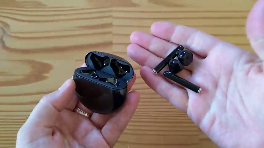 The Huawei FreeBuds 3 Review/Cover By Shazil Butt
 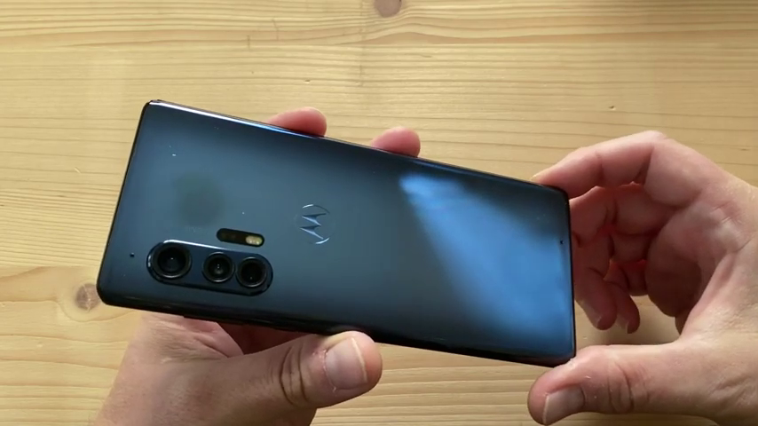 The Moto Edge+ Unboxing/Cover By Shazil Butt
 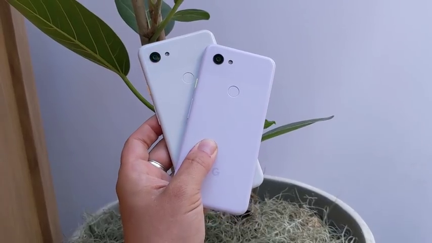 The Google Pixel 3a and 3a XL Review/Cover By Shazil Butt
 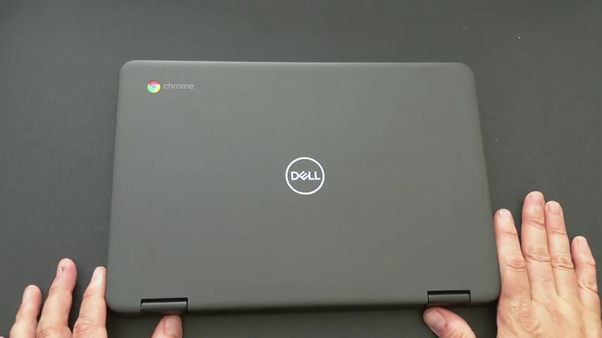 The Dell Chromebook 3100 Unboxing/Cover By Shazil Butt
 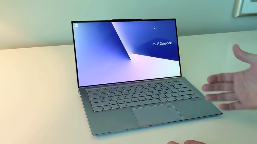 The ZenBook S, StudioBook S, And Mothership/Cover By Shazil Butt
 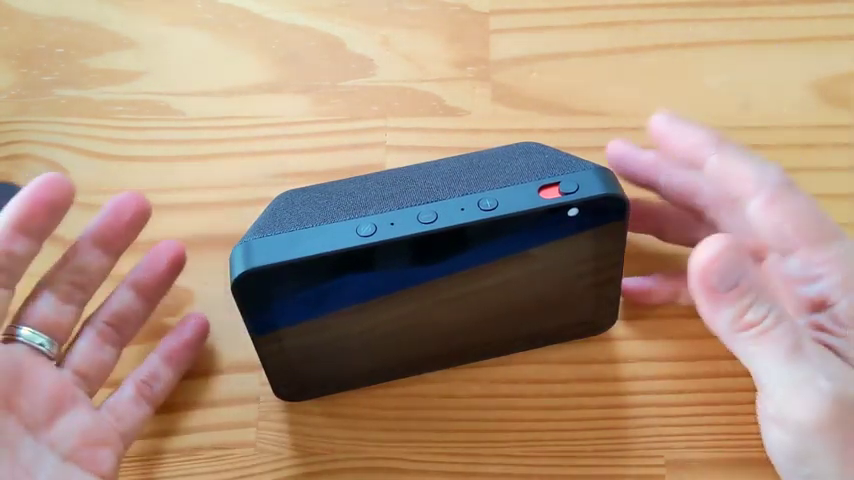 The Amazon Echo Show 5 Unboxing/Cover By Shazil Butt
 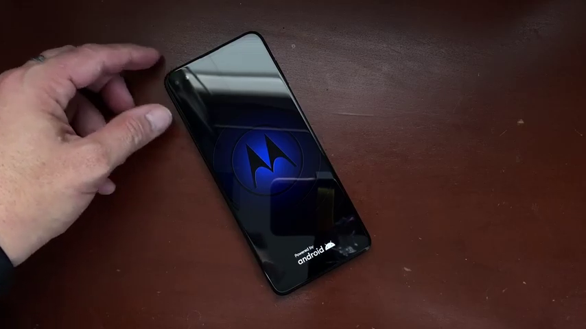 The Moto One 5G Unboxing/Cover By Shazil Butt
  The Google Pixelbook Unboxing/Cover By Shazil Butt
  The OnePlus Unboxing & Review/Cover By Shazil Butt
  The Xiaomi Mi Mix 3 Unboxing/Cover By Shazil Butt